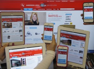
When Google Analytics showed a steady increase in mobile users visiting our website, we knew we needed to make our website a little more mobile friendly. But we were hesitant to invest in a separate site. The solution? A redesigned responsive website.
Responsive web design is an innovative approach to website design and development. Essentially, our website was redesigned and programmed to be fully functional and usable on various screen sizes and devices.
You can see what the different screen sizes look like by opening the andersonlock.com website on your computer, then “grabbing” the lower right hand corner of your screen, dragging it to the left and watching it “re-size” first to a tablet screen size, then to a smart phone size. Or, look us up on your phone. Click the phone icon, or the top blue tab to call us. Click the list icon to search, or to see other menu items. Scroll down to shop by Type or Brand. Everything’s there. Just re-sized.
We launched our responsive website a few weeks ago, and are noticing an even greater increase in mobile traffic. We like that we only have to update content and images in one place. An added benefit is knowing that Google prefers to index one website per URL, so we will benefit from clicks to the same URLs and page content.
We trust that our visitors will like us (Thumbs up Anderson Lock!)…whether visiting us on a computer, laptop, tablet or smart phone!


